- NetWitness Community
- Discussions
- My Dashboard Woes!
-
Options
- Subscribe to RSS Feed
- Mark Topic as New
- Mark Topic as Read
- Float this Topic for Current User
- Bookmark
- Subscribe
- Mute
- Printer Friendly Page
My Dashboard Woes!
- Mark as New
- Bookmark
- Subscribe
- Mute
- Subscribe to RSS Feed
- Permalink
- Report Inappropriate Content
2018-07-05 07:19 AM
Following on from Detail numbers in Dashboard I'd just like to reach out to product management and voice the need for improvement in this area.
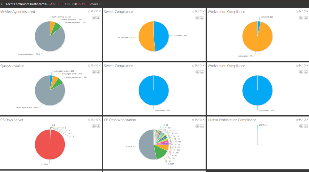
Here is my dashboard. Lets not worry too much about what the data is but let's look at the presentation
Now here is everything that is wrong with it.
- All Pie Charts areof the same size and are just flat. You can't have donut pie charts.
- The labels on the Pie charts get truncated eg "mcafee antivirus on .... 27" so you cant understand what the segment means. This means you have to change your meta to fit.
- There doesn't seem to be any ordering of the values (eg look at CB Days Workstation values)
- A lot of the dashboard is just taken up with empty whitespace.
- You cant bucket values or even work with integer values and put them into buckets.
Should we just be using other tools for Dashboards instead?
Is there any improvement in Dashboards in Netwitness 11?
- Mark as New
- Bookmark
- Subscribe
- Mute
- Subscribe to RSS Feed
- Permalink
- Report Inappropriate Content
2018-07-05 11:13 AM
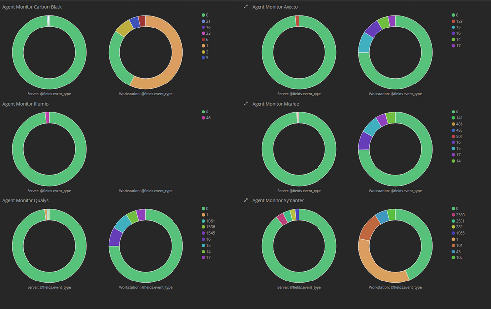
And here's what it could look like in Kibana as an example.
The numbers are "hour since agent last logged in". Based on Test and not live data.
in each Section Servers are on the left, and workstations are on the right.
- Mark as New
- Bookmark
- Subscribe
- Mute
- Subscribe to RSS Feed
- Permalink
- Report Inappropriate Content
2018-07-05 03:42 PM
David:
We have been doing some iterative updates in the 11.x releases, but not significant enough changes to address all the points you have mentioned. We will take a look at these and see what can be addressed in the near-term. We are reviewing options to do a more fundamental change to our reporting capability.
- Mark as New
- Bookmark
- Subscribe
- Mute
- Subscribe to RSS Feed
- Permalink
- Report Inappropriate Content
2018-07-06 01:32 PM
David
Version 11 has many more dashboard issues! Upgrading to version 11 wiped all dashlet queries and doesn't support manually adding these back. Engineering is aware of the problem (dashboards in 11.1.0.1 are useless) and stated the fix will be included in 11.2.
- Mark as New
- Bookmark
- Subscribe
- Mute
- Subscribe to RSS Feed
- Permalink
- Report Inappropriate Content
2018-07-09 07:03 AM
I couldn't agree more with David. When these dashlet types were introduced 4-5 years ago looked better than the previous RSA SIEM enVision. However RSA have gone through many major version up until the v11 which was supposed to introduce a lot more features and keep the product competitive.
However the presentation on the dashboards department has been stale for 4+ years with basic features still missing.
-Simple ways of displaying devices that have stopped collecting is non existent (the page Administration->Event Sources->Alarms cannot be put up on a dashboard).
-Lots of blank white space and not enough options for changing the dashboard layout (ie there is no option to have a page with 3 pie charts on top and a big timeline chart at the bottom)
-There could be an option to hide the Top and bottom toolbar/breadcrumps so they look better when in full screen (looks even worse in v11).
-Limitations on available dashlet types.(ie Cannot use Reporting Engine lists in Investigation Top Values dashlets (I understand why), but RSA should provide alternatives).
-From my point of view, there are only 2 dashlet types that are usable with queries which is really bad, especially when you look at free third party tools or some competitors. Reports realtime chart (which needs a rule and a chart) and Investigation Top values (which can accept queries with serious limitations).
-None of this has so far been improved V11 and even if there was a plan for these to be revamped, the lack of clarity for version roadmaps is not making it any easier for the customers.


