- NetWitness Community
- Discussions
- Re: Better Data Visualisation in Netwitness - how about some D3?
-
Options
- Subscribe to RSS Feed
- Mark Topic as New
- Mark Topic as Read
- Float this Topic for Current User
- Bookmark
- Subscribe
- Mute
- Printer Friendly Page
Better Data Visualisation in Netwitness - how about some D3?
- Mark as New
- Bookmark
- Subscribe
- Mute
- Subscribe to RSS Feed
- Permalink
- Report Inappropriate Content
2018-05-11 04:00 AM
I know that Netwitness 11 has the respond view for Incidents but how about extending this generally to interrogate meta?
Netwitness is very good at collecting data, but not so good when it comes to displaying it.
With the help of a colleague I have been playing around with D3 (https://d3js.org/ ) which is a great library.
As an example of this i wrote a normal report that would output denied connections to a csv file.
The format of the csv was
source,target,total,group
eg
1.2.3.4,4.5.6.7,10,mygroup
This means that there were 10 denied connections from 1.2.3.4 to 4.5.6.7 and 1.2.3.4 was in mygroup.
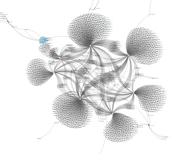
Here is the picture when i fed it some real data.
As you can see there were about 6 large clusters. (In the web page it is possible to zoom in but this is real data!)
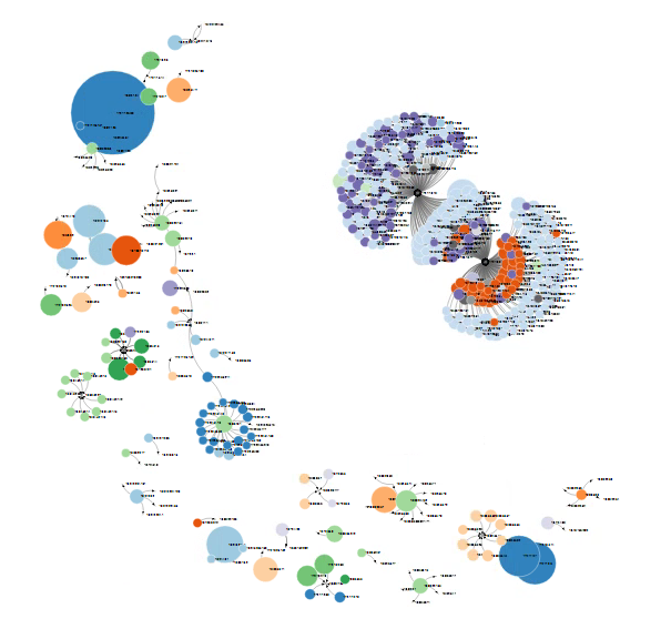
If we exclude these large clusters, then we get a different picture.
Here we can see some more distinct clusters. In particular the one in the top right was traffic to two ip address on the same port.
When these pictures came up on my screen I was surrounded by people who we're asking what they were and were immediately interested. This is the same data that is already in Netwitness, just presented differently.
The advantages of this approach are
- Size of circles shows you how big the problem is
-Colour allows you to identify groups
- Arrows shows you connections
- You can see clusters
Yes, you can find the information already in Netwitness but it does not jump out at you. What would be great is if there was a view were you can narrow down your data and put in into a graph so you can create these graphs in realtime.
In the meantime, this can be done by:
1) Create a directory called /var/netwitness/srv/www/d3/ on the SA Server
2) Creating a report to write out CSV and copy the CSV to the directory /var/netwitness/srv/www/d3/
3) Amend the header line of the CSV so that it reads source,target,total,group
4) Copy the attached html file to this directory
5) Copy the d3.v3.js available from https://d3js.org/d3.v3.js into this directory.
4) Create a SSH Tunnel in putty to map localhost port 8080 to port 80 on the SA Server
5) With an SSH Tunnel to the SA Server navigate to localhost:8080/d3/index.html
Example CSV
source,target,total,group,
172.171.2.61,172.181.3.14,19797,zone1
172.171.2.71,172.181.3.14,19184,zone2
10.242.10.51,10.72.2.14,12828,zone3
- Mark as New
- Bookmark
- Subscribe
- Mute
- Subscribe to RSS Feed
- Permalink
- Report Inappropriate Content
2018-05-11 08:59 AM
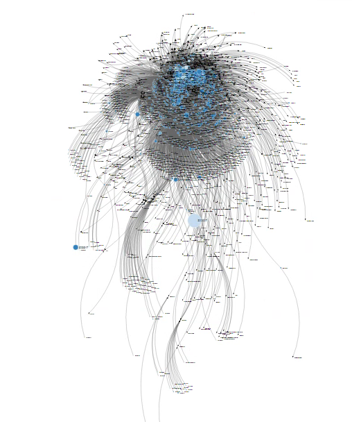
Here is a picture of blocked connections through the web proxy.
Its zoomed out to preserve anonymity, but what it shows is that lots of different users are going to lots of different websites. To the south of the picture is a large light blue circle that identifies a user who is getting blocked a lot. The size of the circle is much large than others so is worthy of further investigation.
- Mark as New
- Bookmark
- Subscribe
- Mute
- Subscribe to RSS Feed
- Permalink
- Report Inappropriate Content
2018-05-11 10:21 AM
I also see the tremendous value of using D3 to represent data this way.
Thank you for sharing this!
- Mark as New
- Bookmark
- Subscribe
- Mute
- Subscribe to RSS Feed
- Permalink
- Report Inappropriate Content
2018-05-11 11:48 AM
David:
Great information and thanks for sharing. Would love to discuss with you further in terms of use cases as there are so many D3 graphs available. We have had discussions on updating the D3 nodal diagram in Respond to allow it to be available for use as an investigative interface. I would also like to convert this thread into an Idea (RSA Ideas for the RSA NetWitness Platform) to see what priority other users of NetWitness would rank this. There are some ideas around improvements to charts and reports, but think this is somewhat different.
- Mark as New
- Bookmark
- Subscribe
- Mute
- Subscribe to RSS Feed
- Permalink
- Report Inappropriate Content
2018-05-14 03:42 AM
Morning Bill,
I've sent you a direct message with my email address so you can contact me offline .
I'm not a D3 expert by any means but there are lots of ways of displaying data, ranging from standard pie chart, graphs etc, to the directed graphs which I've displayed above.
I think it would be nice just to have another way of visualising data. In the same way that a pie chart might not be suitable in some cases, it depends on the data and what you are trying to show.
I think the power of directed graphs is when you have source, destination and then variable type displays.
Management love graphs and pretty pictures. It's what sells products, so making things looks nice hook people into the product and then get them interested.
I'll claim my 1% of any royalties from this!
- Mark as New
- Bookmark
- Subscribe
- Mute
- Subscribe to RSS Feed
- Permalink
- Report Inappropriate Content
2018-05-17 05:29 AM
Indeed maybe RSA should license this product to put it in:
KeyLines Network Visualization Software
The ability to filter, zoom in and out , highlight clusters would be really powerful.
- Mark as New
- Bookmark
- Subscribe
- Mute
- Subscribe to RSS Feed
- Permalink
- Report Inappropriate Content
2018-05-17 03:25 PM
- Mark as New
- Bookmark
- Subscribe
- Mute
- Subscribe to RSS Feed
- Permalink
- Report Inappropriate Content
2018-06-06 08:15 AM
Following on from this, I had a lot of success with a tool called Gephi, which happens to be free! https://gephi.org/
I'm not an expert by any means, but you can take a CSV file and construct a graph easily. You need to import your CSV as the edges table, and then make sure that "create missing nodes" is ticked.
Once you have done this you can then play with your graph.
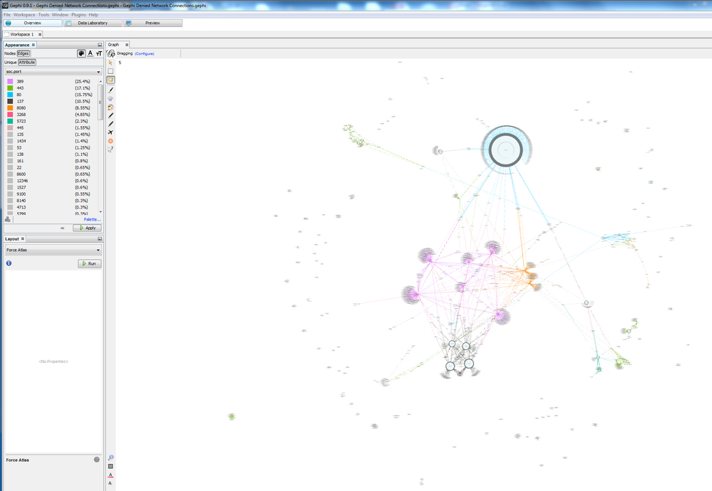
Here is an example. You can zoom in and filter your data. It really is a very powerful tool.
The graph below shows denied connections with the edge colour representing the different tcp port the connection is on.


