This website uses cookies. By clicking Accept, you consent to the use of cookies. Click Here to learn more about how we use cookies.
Turn on suggestions
Auto-suggest helps you quickly narrow down your search results by suggesting possible matches as you type.
Showing results for
- NetWitness Community
- Support
- Community Support
- Ideas & Suggestions
- Standardize RSA Link Product Version/Resources Menu
-
Options
- Subscribe to RSS Feed
- Mark as New
- Mark as Read
- Bookmark
- Subscribe
- Printer Friendly Page
- Report Inappropriate Content
LaurenBrodt

Apprised Contributor
Options
- Subscribe to RSS Feed
- Mark as New
- Mark as Read
- Bookmark
- Subscribe
- Printer Friendly Page
- Report Inappropriate Content
2018-08-02
02:49 PM
Status:
New
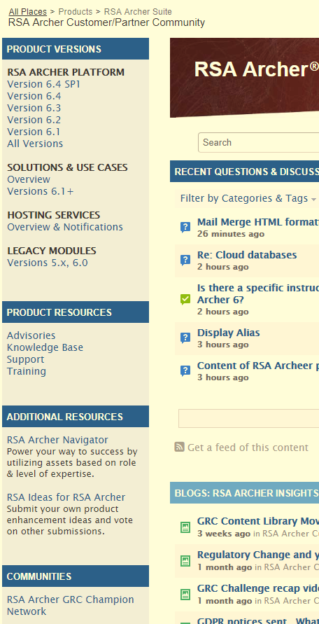
On the main RSA Archer Suite RSA Link page, the Product Version/solutions/resources menus are all on the right hand side.
Once you enter the RSA Archer Customer/Partner Community, the menus are not only on the left, but some subtopics are in a different order or renamed (ex. Product resources on main page vs Product Resources/Additoinal Resources in Customer/Partner Community).
This is confusing and I often find myself looking all over for what I need. I propose standardizing the menus (right hand side seems to be standard for most of the other pages, like RSA Navigator).
3 Comments
You must be a registered user to add a comment. If you've already registered, sign in. Otherwise, register and sign in.

© 2022 RSA Security LLC or its affiliates. All rights reserved.


