- NetWitness Community
- Support
- Community Support
- Community Support Forum
- Side panels too large, main content too small
-
Options
- Subscribe to RSS Feed
- Mark Topic as New
- Mark Topic as Read
- Float this Topic for Current User
- Bookmark
- Subscribe
- Mute
- Printer Friendly Page
- Mark as New
- Bookmark
- Subscribe
- Mute
- Subscribe to RSS Feed
- Permalink
- Report Inappropriate Content
2021-03-01 12:01 PM
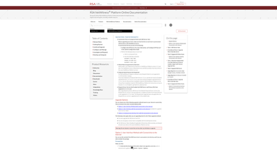
Looking over the formatting of the pages the side panels appear to be way to large compared to the center panel that contains the information you are trying to focus on. The side panels should be of a smaller size by comparison as it draws your attention away from what should be the focus of the page to the navigation and secondary panels. Because of this smaller center panel the main content is squished and makes for a longer document then what would generally be needed.
- Labels:
-
Other Topics
Accepted Solutions
- Mark as New
- Bookmark
- Subscribe
- Mute
- Subscribe to RSS Feed
- Permalink
- Report Inappropriate Content
2021-03-01 06:09 PM
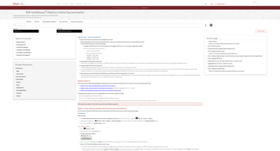
I've sent in a case to the Link team with my theory as to what's up, it seems there's a CSS value set for max-width to 1310px, which limits how wide things can scale:
If we change that to instead be 90%:
Once the stability issues are addressed, I'm sure they'll get to it.


